Philabundance Brand Redesign
Logo/Brand Design
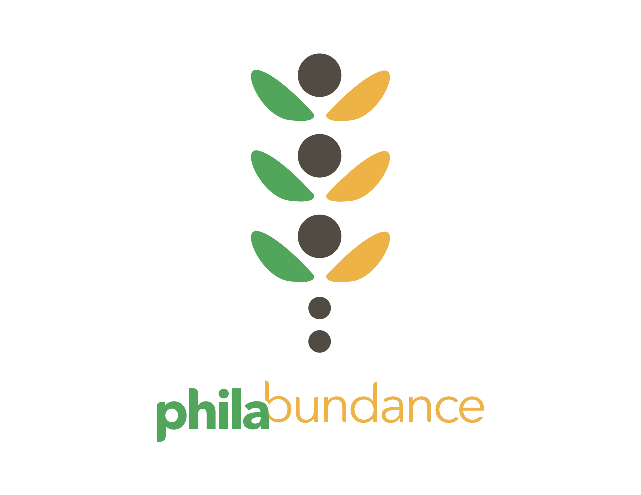
For my first brand design course at Drexel University, I was assigned the local food bank and distributer Philabundance. The company is a non-profit organization that aims to fight poverty in Philadelphia, specifically the lack of food.
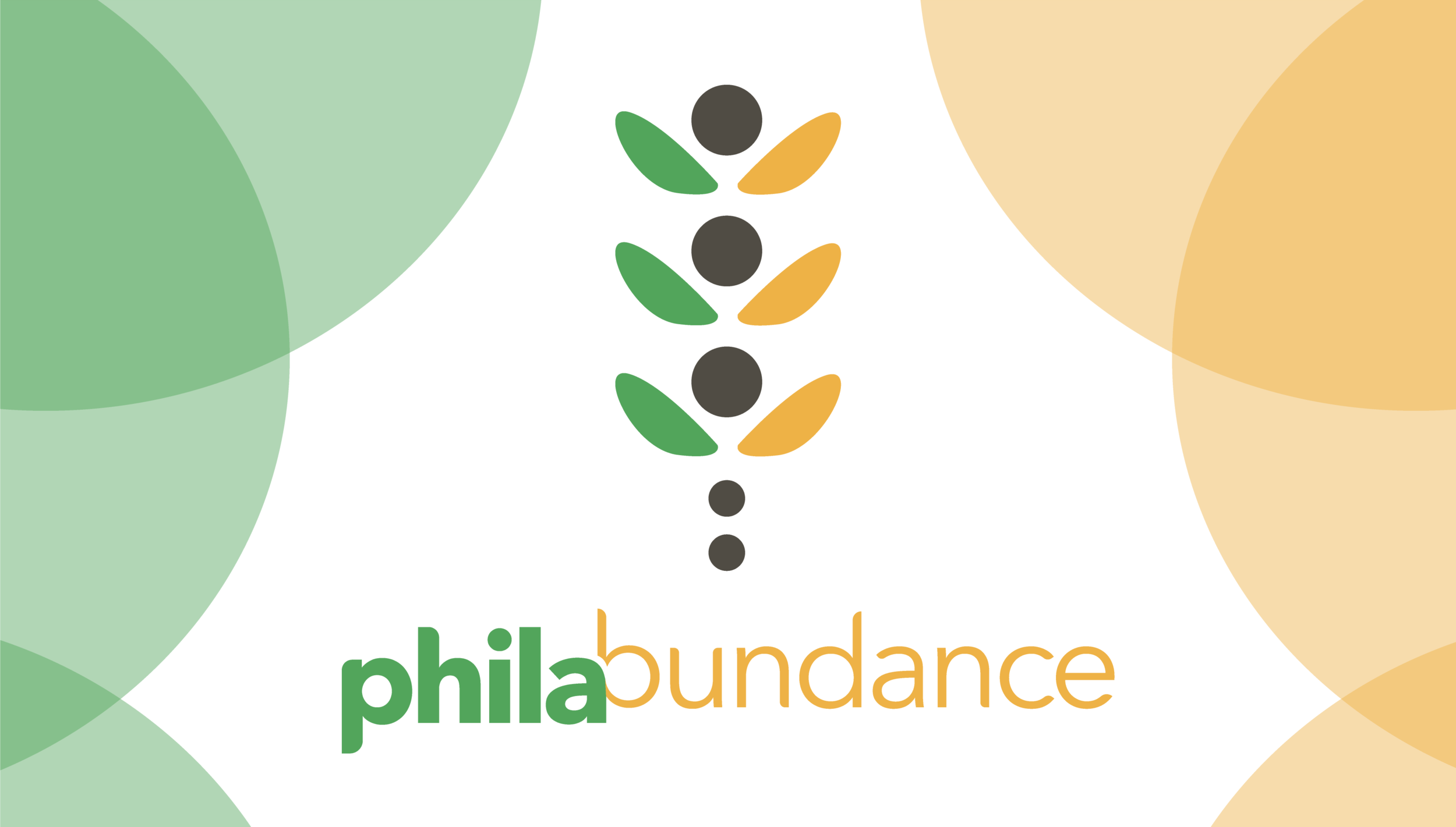
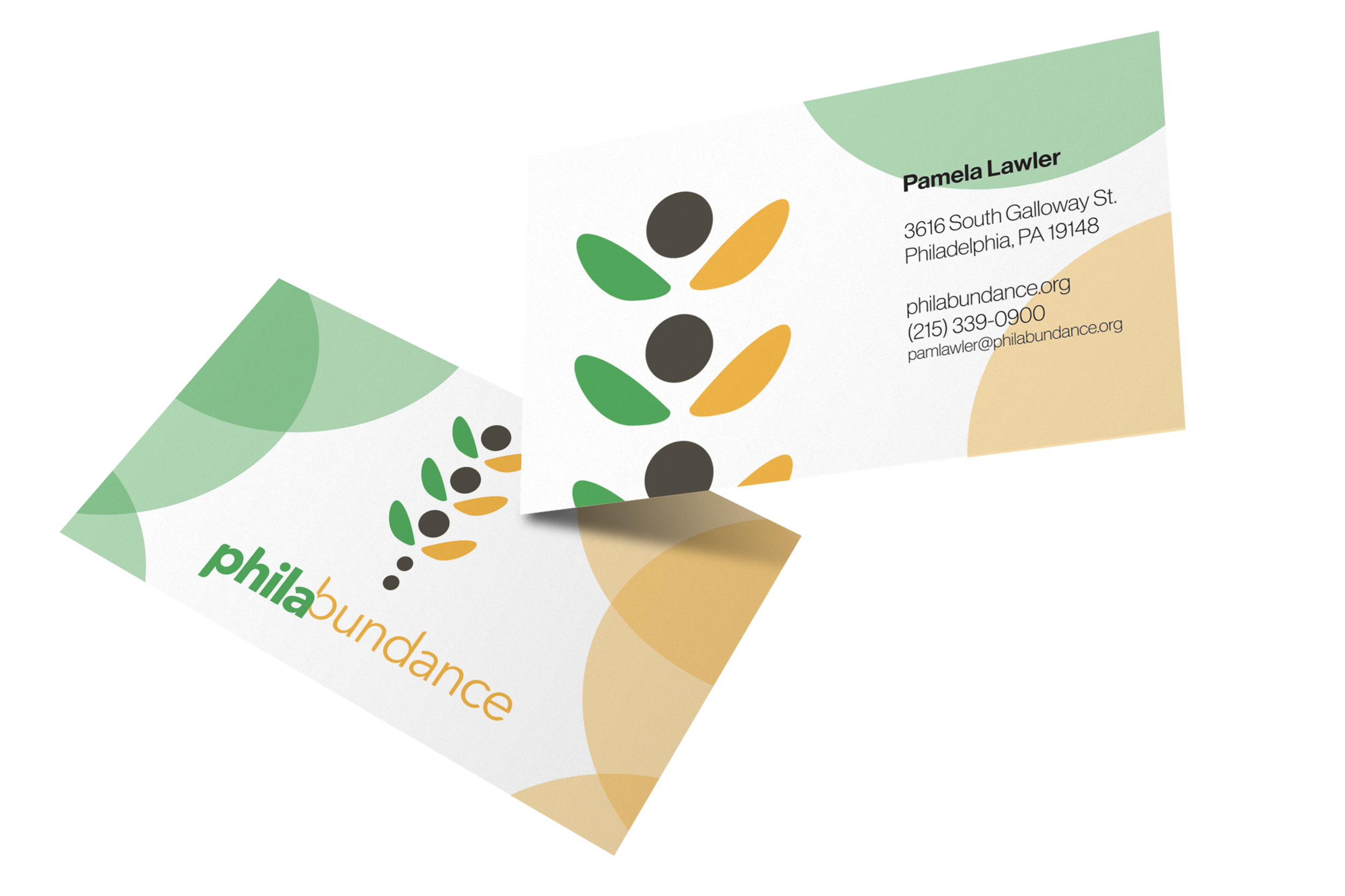
For this logo, I tried to keep the more serious and nurturing themes of the company clear. I used a green, yellow, and gray palette to represent produce and crops. I specifically chose the shade of yellow to represent wheat, as it related to the idea of an “abundance” of food, per the company name. For the form of the logo, I wanted to embody the two biggest parts of the company: food and community. To achieve this I created the abstract logo seen here, creating the idea of a wheat stalk out of organic shapes of people. The branches of the stalk are three forms of a head and raised arms as a symbol of giving, relating back to the company’s mission.
January, 2021