Typographic Composition Gallery
This page has the smaller typographic projects that I have completed during my time inside and outside of Drexel University. These projects were best created throughout my Publication and Typography courses.
A condensed slideshow of all type work can be found at the bottom and is being updated frequently.
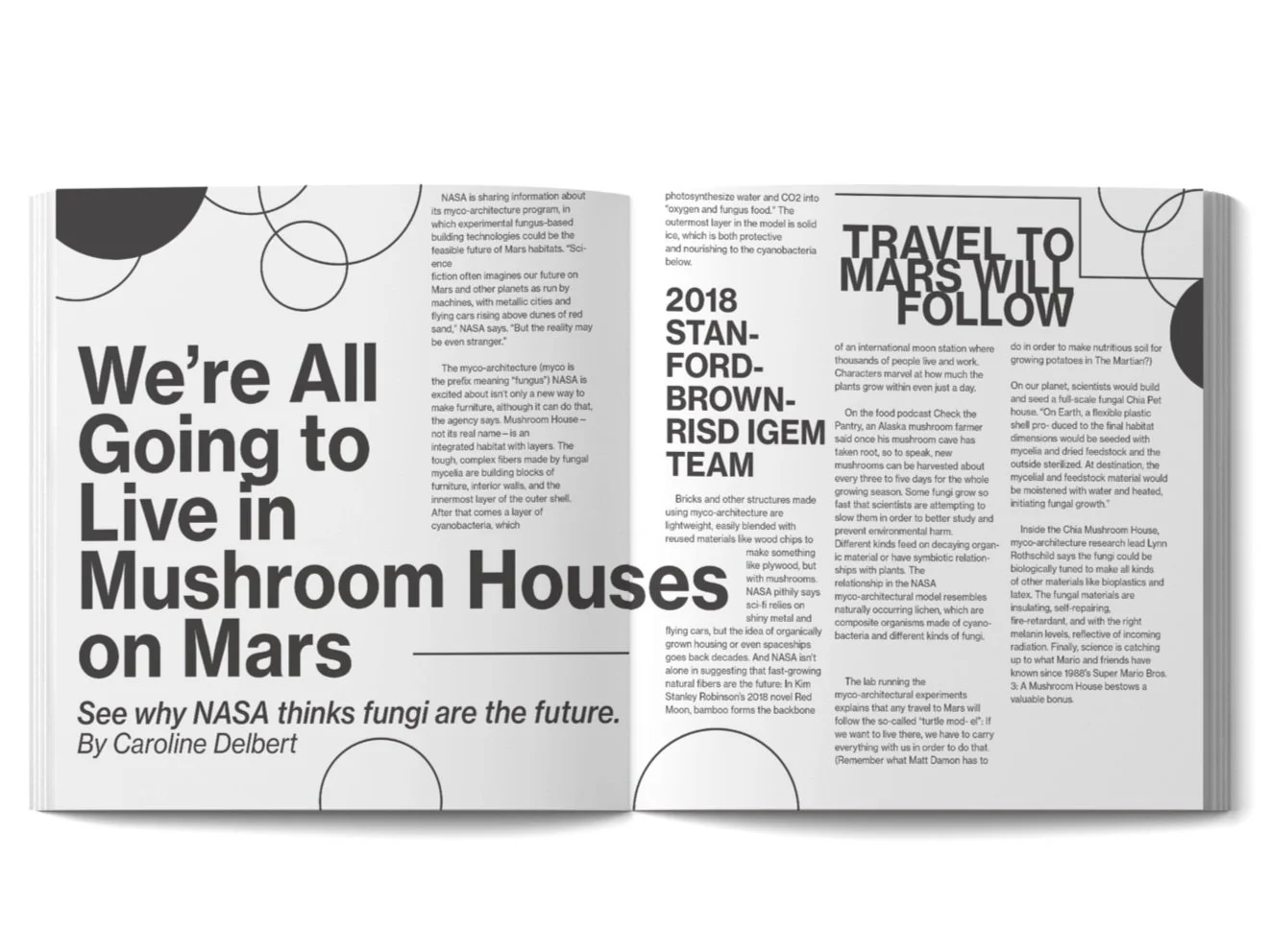
Mushroom Houses Composition
This spread was created in Spring of 2020 during one of my introductory courses to typography and publication design. I experimented and got used to utilizing type hierarchy to create a more interesting visual experience. The circles in the margins were intentionally placed to reference the idea of a mushroom.
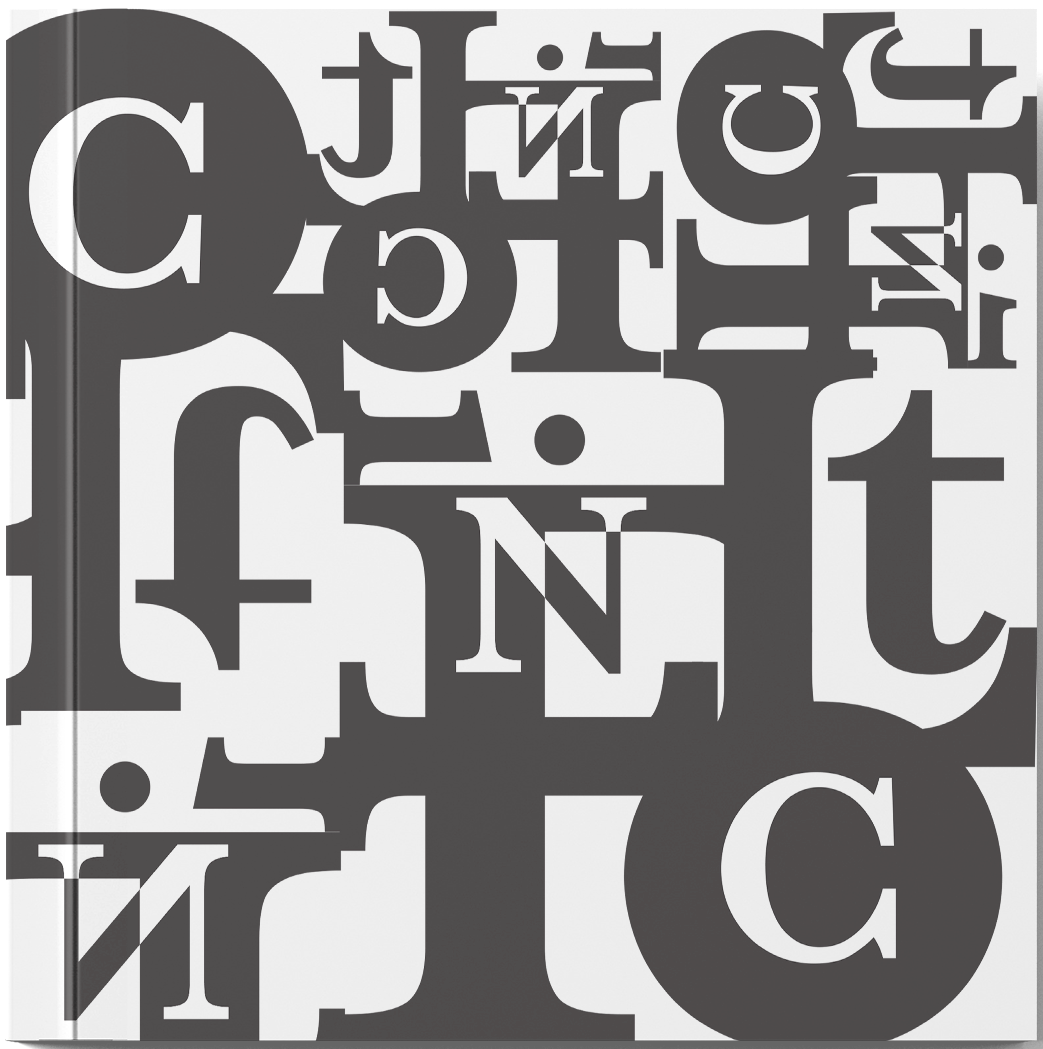
Experimental Type Cover “Conflict”
This is another early typographic experiment that I created in Spring 2020. The project expresses the feeling of “conflict” using the characters from the word itself. The tightness and overlapping elements create many visual paths for the eye to take while reading it.

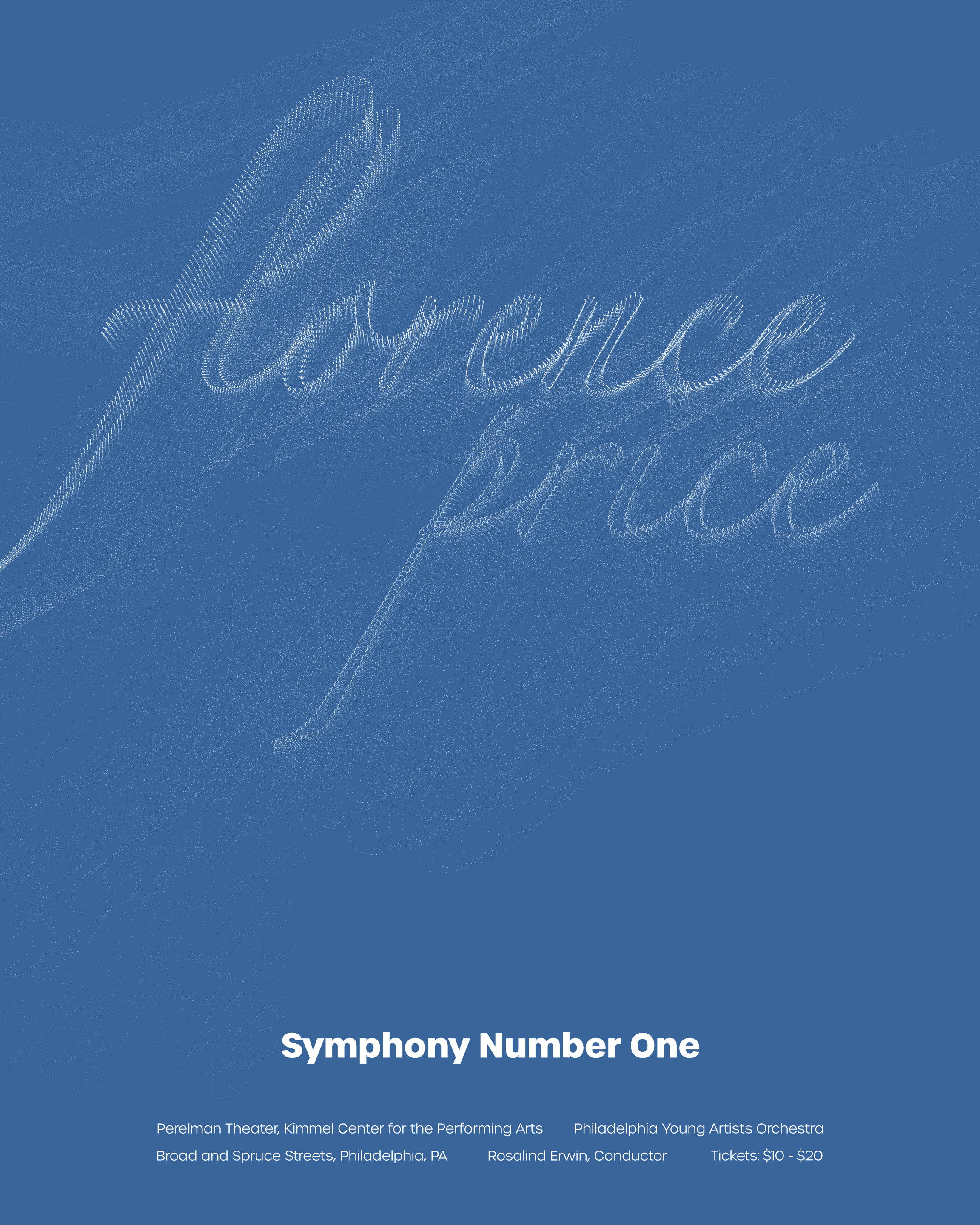
Florence Price Symphonic Poster
This project was a later endeavor in typographic experimentation using composer Florence Price’s “Symphony No. 1”. After thoroughly listening through Price’s piece, I referred to my notes and found the song expressed an idea of togetherness, and finding a greater whole from smaller pieces. The first and second Acts contrast one another, yet by the third and fourth have come together to create a beautiful and unified sound.
This poster represents those ideas by using micro stipples to create larger and more elegant letterforms. The type has a feeling of lightness and beauty, and is brought together into the composition by the contrasting subtext in the lower half. This piece gave me a lot of great experience working with my software to create experimental digital graphics.

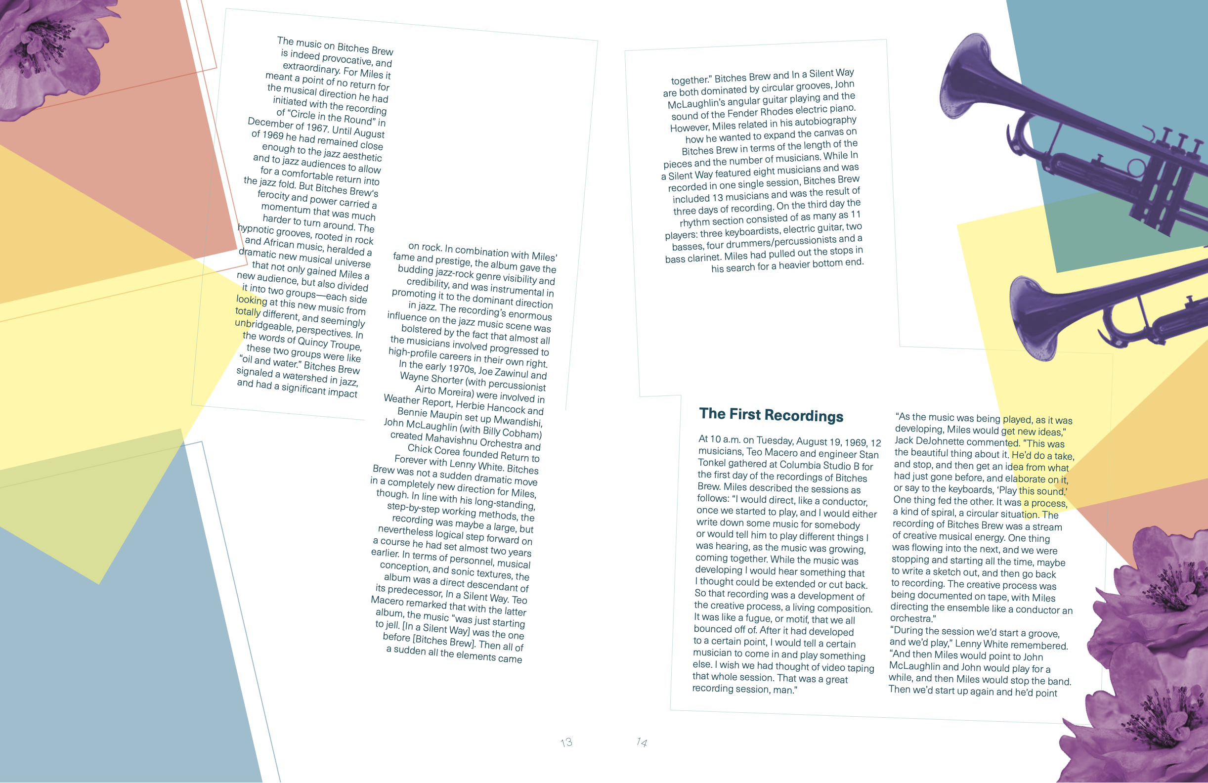
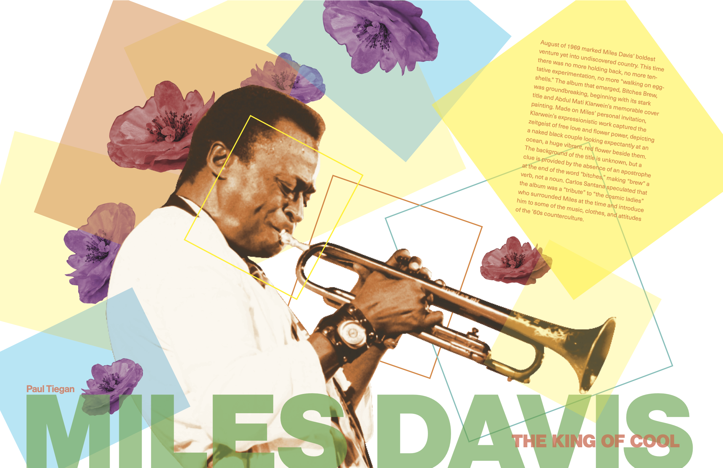
“Dal Segno” Jazz Publication
“Dal Segno” is an original publication concept that I created in the Spring of 2021. After developing my featured story, I gained valuable experience working with type on a more freeform grid. This was a large step out of my comfort-zone for the experience I had at the time, and I am very happy with how it came together.
The type in the main spread utilizes an extreme variation in type size to create typographic hierarchy that matches the energy of the subject. There is a visual path in the opening spread that leads your eye down the trumpet and title into the body type, despite being set off-grid. The following spread utilized rules and the context set in the opener to allow the fittingly off-beat text to be read easily while also being free-form as well.


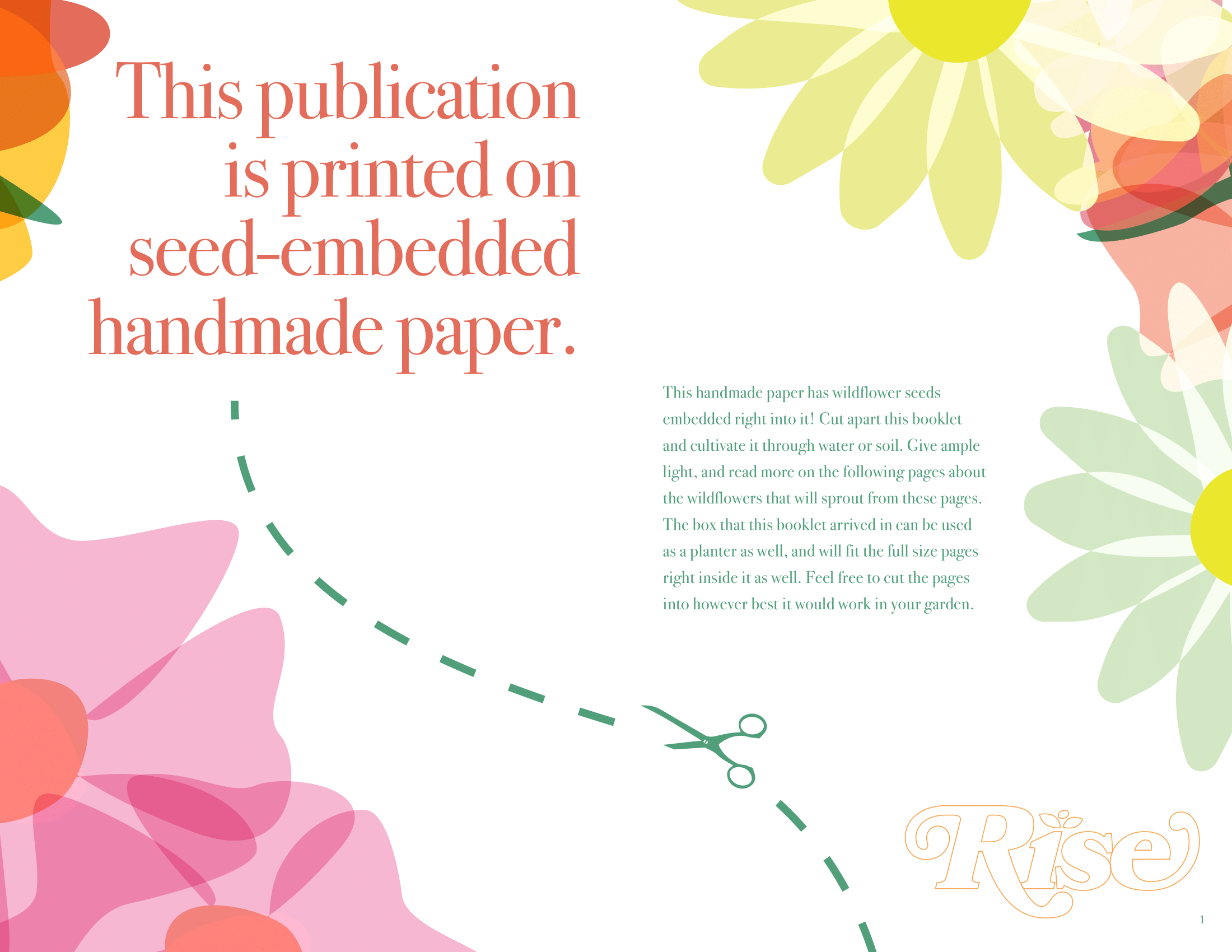
“Rise” Experimental Publication
“Rise” is an original experimental gardening publication I created in Spring-Summer of 2021. The purpose of this project was to combine the subject of an original publication with the medium it is presented on. The publication focuses on gardening, more specifically hydroponic cultivation of wildflowers. I achieved this by printing all 24 pages on custom paper which contained wildflower seeds embedded within it.
During those 24 pages, I had a lot of time to hone my skills with type. Each page incorporates typographic hierarchy to keep the reading experience relaxed and easy without losing its visual intrigue.
A tremendous amount of work went into “Rise” with more information available below.
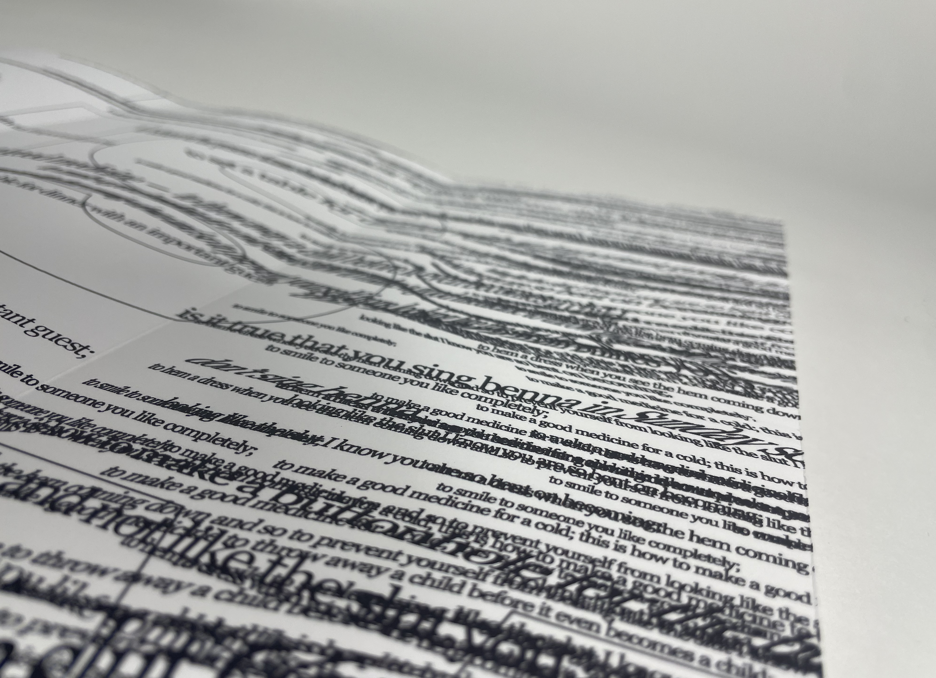
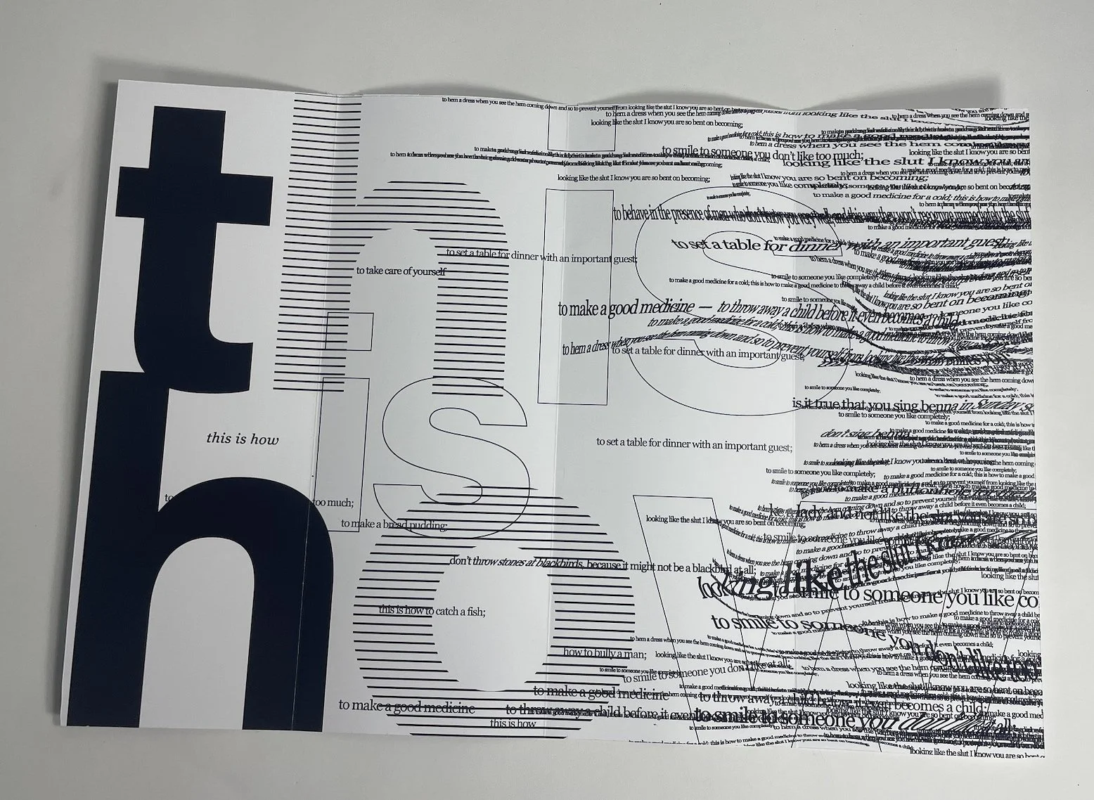
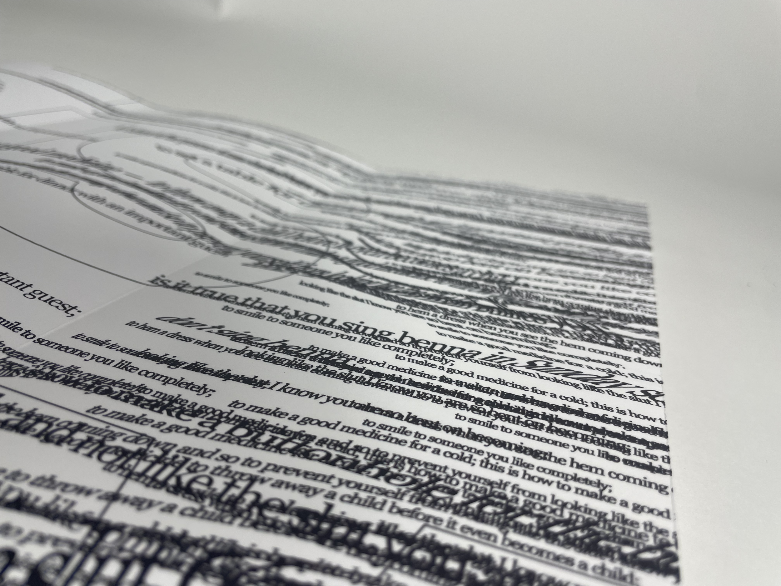
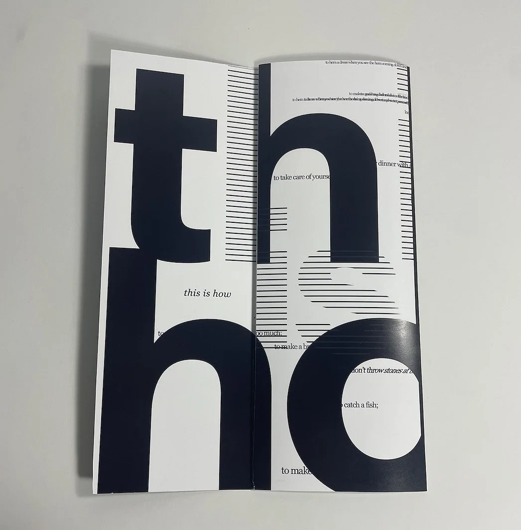
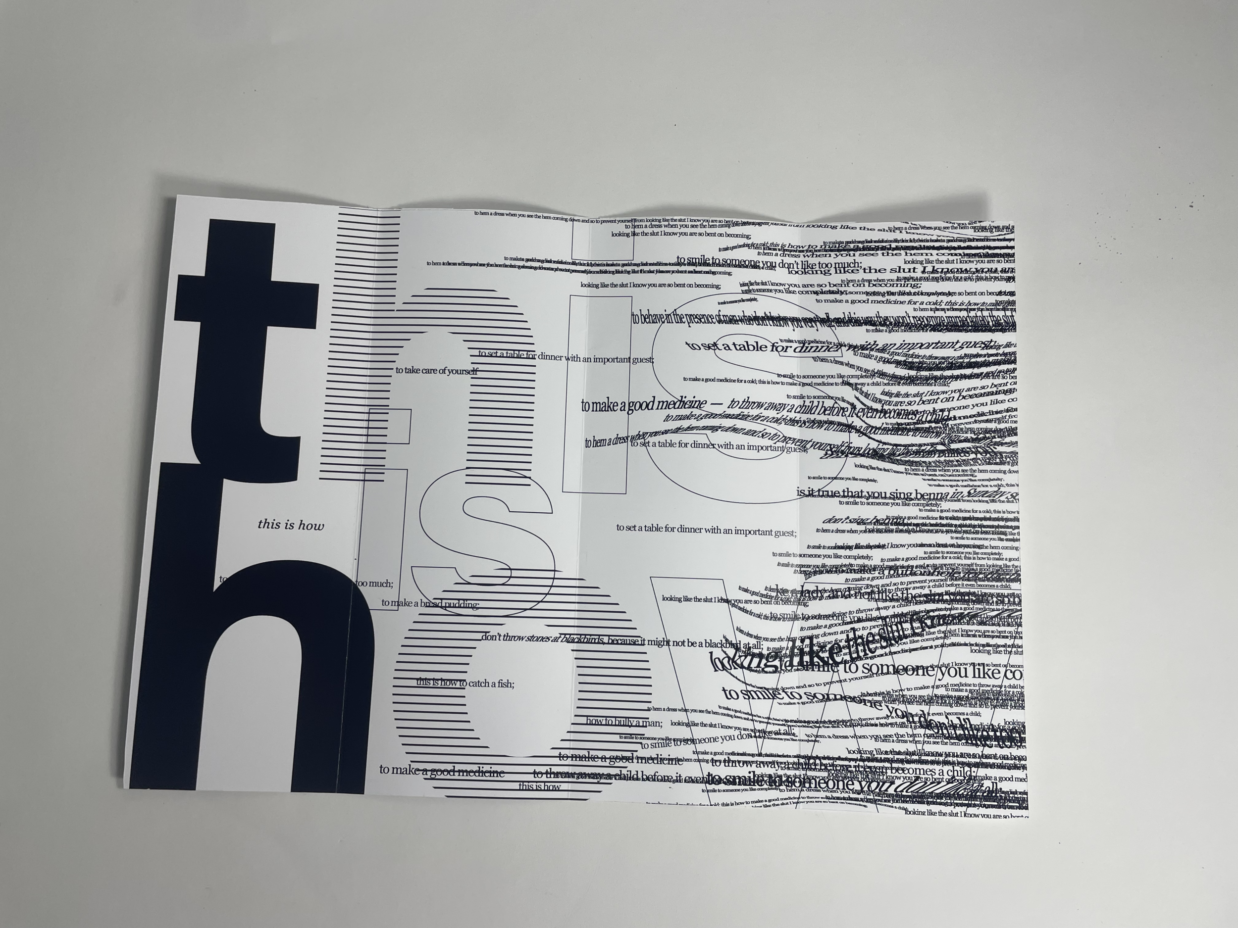
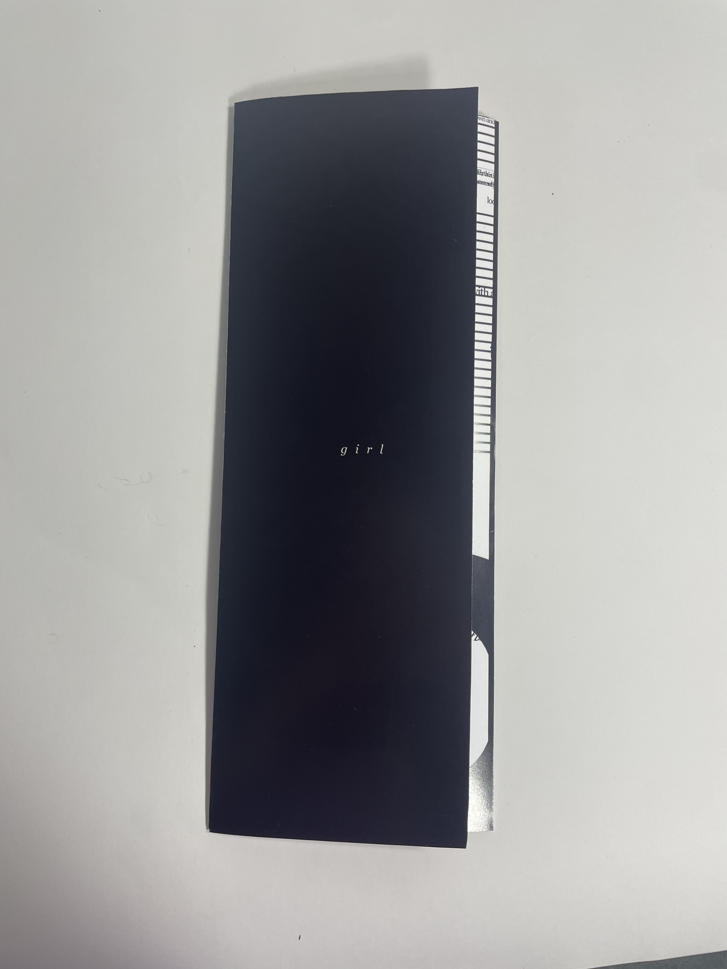
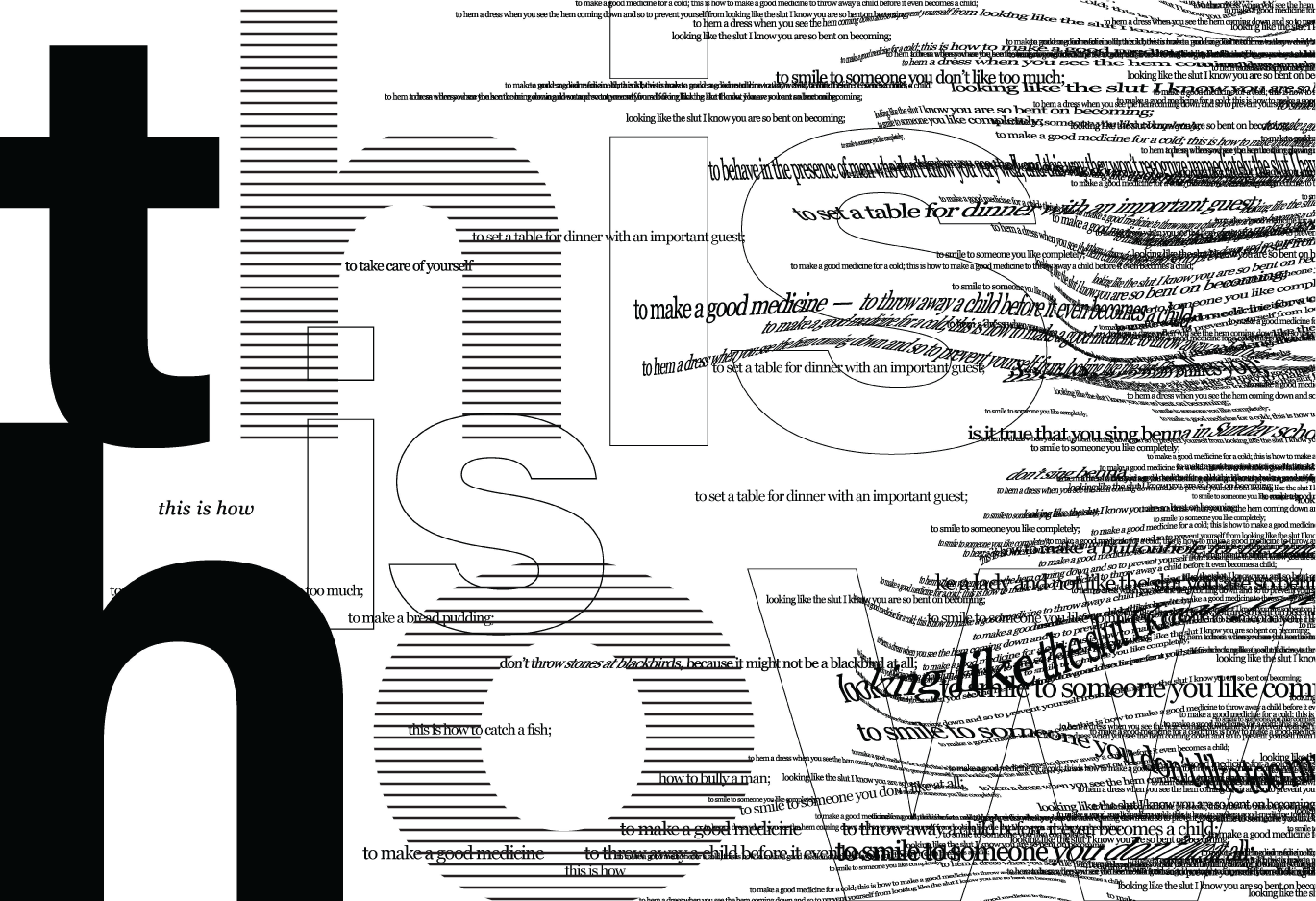
“Girl” by Jamaica Kincaid Roll-Fold
“Girl” is a famous poetry piece written by Jamaica Kincaid in 1978. I took this poem and applied the themes of the story into a visual form and experience through the usage of typography and a rolling-fold format. The story is told from the perspective of a young girl in a conservative environment for the time, and has heavy themes of oppression, suffocation, and anguish. I felt the best way to express these feelings is to take the amphora that is used, and give it a heavy weight and overwhelming type. The type that I used came from the poem itself. It is a great poem if you have not read it before!
I printed this piece at 11x17 inches double-sided, and created clean folds opening from left to right. I was challenged with the planning process of this composition by taking into account the forms it would take throughout the opening sequence. Utilizing the double-sided print, I created the visible compositions by planning fold thickness, paper thickness, and scoring methods in advance. Having each page line up to create a seamless visual was challenging, but a rewarding experience overall!
Full prints are in the Gallery below